

Making Digital Services consistent, accessible,and ready to use.
Audit what you have, design with tested components, develop with accessible code. All free to use.
One design system to build any website or app
For designers
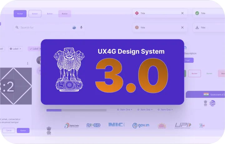 Figma UI kit (opens in new tab)Ready-to-use screens, components, and design tokens
For developers
 Component library (opens in new tab)Production-ready code with live interactive examples
Ready-made pages
 Themes and templates (opens in new tab)Full page layouts styled in your own brand colours
Already have a website?
 Migration guide (opens in new tab)Switch smoothly from Bootstrap or Tailwind, step by step
Why use UX4G
Spend less time on visualizing, and more time on conceptualizing the right solutions.
Text everyone can read
Tested font sizes and sharp contrast ratios ensure content stays clear, legible, and easy on the eyes.
Responsive on every screen
Layouts adapt automatically from small phones to large desktops, with no extra styling needed.
Usable by everyone
Built for screen readers and keyboard navigation, making accessibility compliance smooth and stress-free.
Your brand colours, still accessible
Apply your own visual identity and colours while keeping contrast and readability intact.
The same shapes everywhere
Buttons, forms, and navigation behave predictably across every screen so users never have to re-learn.
In your users’ language
Every component is designed to support multilingual text and different scripts without breaking page layouts.
UX4G MCP
Connect the UX4G MCP and build with your AI tools.
Describe the page people need. Your AI agent builds it from official UX4G components, tokens and accessibility rules.
Set up the UX4G MCP (opens in new tab)A prompt asking for an application form with mobile OTP sign-in goes through the UX4G MCP, which builds a 'Verify your mobile' OTP screen with the matching UX4G React code
Products to build, test and streamline your services
Everything you need to test accessibility, theme layouts, and guide your team in one place.
The same experience for every visitor, whatever their needs, with instant controls for contrast, text size, and screen reading. Built to WCAG guidelines.
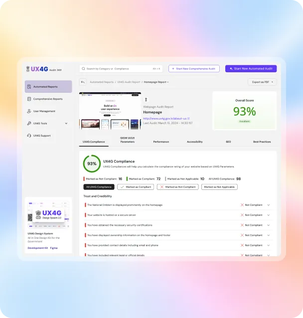
Add to your websiteRun Audit 360 on your live service to find accessibility, usability and consistency issues, ranked by impact.
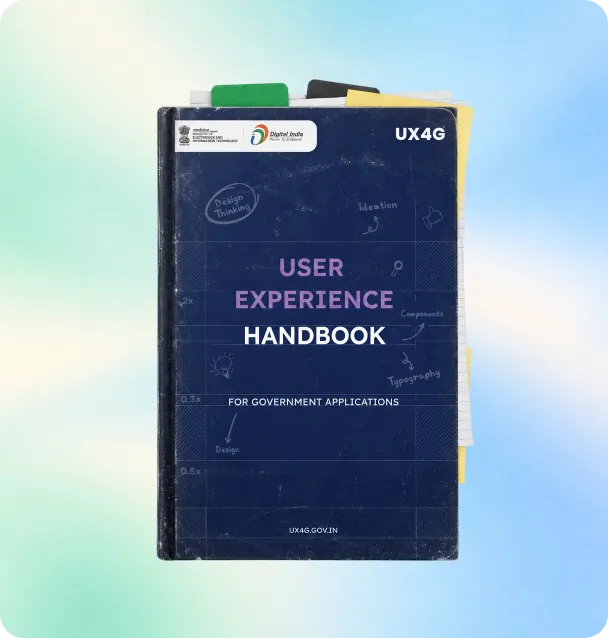
Start an auditA practical guide for departments and vendors on planning, designing and testing citizen services.
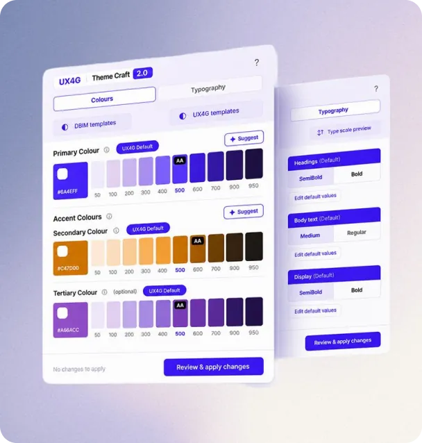
Read the handbookGenerate an accessible UX4G theme from your brand colours, right inside Figma.
Get the plugin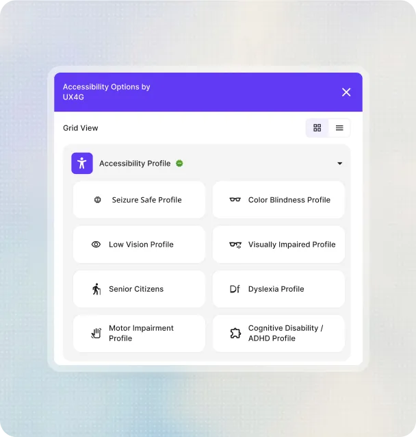
Services already built with UX4G
How national services used UX4G to make citizen journeys simpler.
 National Scholarship PortalHow the National Scholarship Portal moved its student services onto UX4G components.Education
 mAadhaarA rebuilt identity app that keeps its flows accessible on low-end devices.Identity
 Voter HelplineVoter services redesigned around one consistent, multilingual journey.Elections
 ABHA: Digital Health RecordsIndia’s digital health ID system enabling citizens to manage their health records digitally.Health
 112: Quick Emergency AccessIndia’s unified emergency response number providing quick access to police, fire, and ambulance services.Safety


Ready to start? Explore UX4G Design System 3.0.
Explore Design System 3.0Frequently asked questions
Government platforms are used by every kind of citizen, from urban professionals to rural residents, students to senior citizens, first-time internet users to daily digital users. Poor UX leads to confusion, drop-offs, and repeat office visits. Good UX means faster, clearer services for everyone, regardless of where someone lives or how familiar they are with technology.
A UX audit shows where citizens get stuck, which pages fail accessibility checks and what to fix first, so your team spends effort where it improves the service most.
Those are standards. UX4G turns them into ready components, tokens and patterns so teams meet the standards by default instead of interpreting them from scratch.
Yes. The UX4G Design System, Figma kit and code libraries are free for all government departments and their vendors.
No widget can do that alone. It gives visitors extra controls, but your pages still need accessible structure, content and code to comply.
UX Audit 360, the Accessibility Widget, the Theme Craft plugin, the UX Handbook and the UX4G MCP for AI-assisted development.
Hands-on sessions that train designers, developers and officials to apply UX4G and user-centred design in their own projects.
Yes. Connect the UX4G MCP to your AI tools and they build pages from official UX4G components, tokens and accessibility rules.
Share the UX4G documentation and migration guide with them, and include UX4G compliance in your project requirements.